
Café app from Philadelphia
Application that helps order coffee and snacks even before coming to the café.
Project overview
2021 - 2022

The problem:
Offline order takes too much time: wait for your turn to pay and then wait for the order to be ready

The goal:
Create features that help users to order coffee online + to make order from a table

My role:
UX/UI designer, UX researcher

Responsibilities:
User research, paper and digital wireframing, conducting interviews low and high-fidelity prototyping, accounting for accessibility, iterating on designs.
- The problem:Offline order takes too much time: wait for your turn to pay and then wait for the order to be ready
- The goal:Create features that help users to order coffee online + to make order from a table
- My role:UX/UI designer, UX researcher
- Responsibilities:User research, paper and digital wireframing, conducting interviews low and high-fidelity prototyping, accounting for accessibility, iterating on designs.
Usability Study
User research: summary
I conducted an interview and created an empathy map to understand the target audience of the app. I identified 2 main groups: people who come to the cafe to work and those who systematically order takeaway coffee in large volumes.
I have identified 2 key problems faced by customers: the risk of losing a place when ordering coffee and the need to wait for an order if it is prepared with you.
Pain points
- Time. Big orders have to wait a long time
- Place. You can lose your seat while making an order
- Line. There may be a line at the counter from those who want to make an order
Persona: Jim
Problem statement: Jim is an Intern at a business company
who needs a faster and more collaborative way to take many coffee orders from co-workers at one time because Taking individual orders takes too much time, so Jim can’t make other tasks at that time.
Problem statement: Jim is an Intern at a business company
who needs a faster and more collaborative way to take many coffee orders from co-workers at one time because Taking individual orders takes too much time, so Jim can’t make other tasks at that time.

Persona: Rebecca
Problem statement: Rebecca is a busy freelancer
who would like to order without getting up because she can potentially lose her table.
Problem statement: Rebecca is a busy freelancer
who would like to order without getting up because she can potentially lose her table.

User journey map 1
Mapping Jim's user journey revealed how helpful it would be
to have access to an app.
Mapping Jim's user journey revealed how helpful it would be
to have access to an app.

User journey map 2
Mapping Rebecca's user journey revealed the problems with orders.
Mapping Rebecca's user journey revealed the problems with orders.

Big picture storyboard
Scenario: place an order in cafe without leaving the table
Scenario: place an order in cafe without leaving the table

Close-up storyboard
Scenario: the same, place an order in cafe without leaving the table
Scenario: the same, place an order in cafe without leaving the table

Competitive audit
My competitive audit includes direct and indirect competitors. Competitors' strengths and weaknesses helped me to find a better solution and avoid some mistakes. Link to the document

Paper wireframes
I started with drafts to check if the problem is solved. I wanted to remove some mistakes at an early stage. For the home screen, I prioritized a quick and easy ordering process to help users save time.
I started with drafts to check if the problem is solved. I wanted to remove some mistakes at an early stage. For the home screen, I prioritized a quick and easy ordering process to help users save time.

Digital wireframes

The low-fidelity app prototype
was tested and can be viewed here.

Screenshot from figma
Research insights
1. Users need a more visible "Order" button
The usability study showed that
4 out of 5 users needed some time to find the "Order" menu item
“Can't see where I can start to order." (P0)
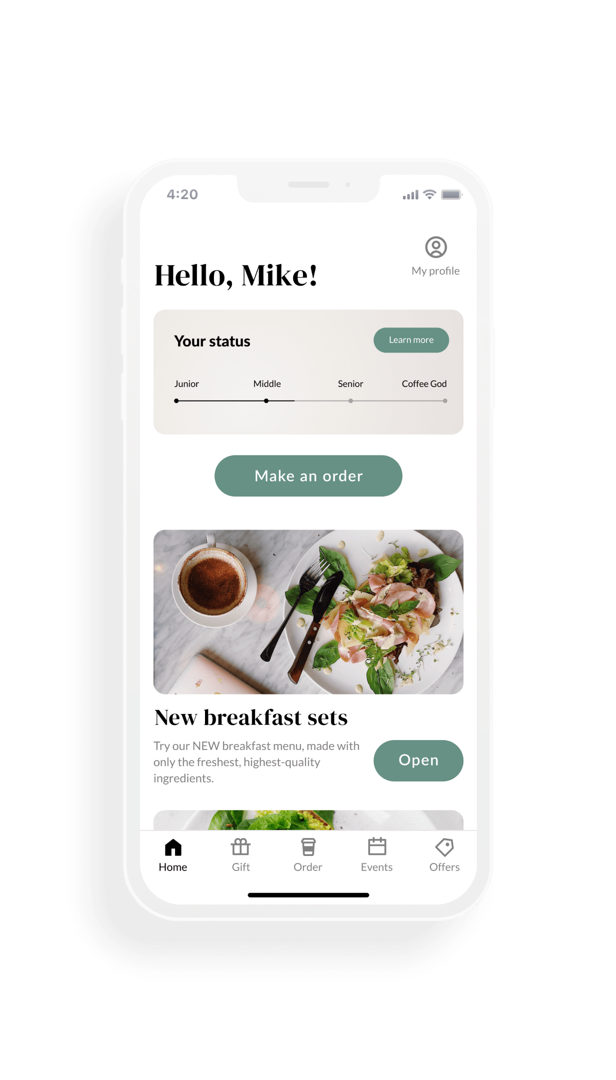
Solution: make a block on the main page with the "Make an order" button and then this block will show the order status.
4 out of 5 users needed some time to find the "Order" menu item
“Can't see where I can start to order." (P0)
Solution: make a block on the main page with the "Make an order" button and then this block will show the order status.
1. Users need a more visible "Order" button

The usability study showed that
4 out of 5 users needed some time to find the "Order" menu item
“Can't see where I can start to order." (P0)
Solution: make a block on the main page with the "Make an order" button and then this block will show the order status.
4 out of 5 users needed some time to find the "Order" menu item
“Can't see where I can start to order." (P0)
Solution: make a block on the main page with the "Make an order" button and then this block will show the order status.
2. Users need an active order status on the main page
The usability study showed that
2 out of 5 users were frustrated that they could not find the order status.
“How can I see my order status from main page?" (P1)
Solution: make a block on the main page with the "Make an order" button and then this block will show the order status.
2 out of 5 users were frustrated that they could not find the order status.
“How can I see my order status from main page?" (P1)
Solution: make a block on the main page with the "Make an order" button and then this block will show the order status.
2. Users need an active order status on the main page

The usability study showed that
2 out of 5 users were frustrated that they could not find the order status.
“How can I see my order status from main page?" (P1)
Solution: make a block on the main page with the "Make an order" button and then this block will show the order status.
2 out of 5 users were frustrated that they could not find the order status.
“How can I see my order status from main page?" (P1)
Solution: make a block on the main page with the "Make an order" button and then this block will show the order status.
3. Users need better presentation and cues in flow with QR scanning
The usability study showed that
3 out of 5 users had difficulties with ordering through scanning a QR code
“Where can I find the QR code?" (P2)
Solution: make short guide before ordering, so user can prepare for it.
3 out of 5 users had difficulties with ordering through scanning a QR code
“Where can I find the QR code?" (P2)
Solution: make short guide before ordering, so user can prepare for it.
3. Users need better presentation and cues in flow with QR scanning

The usability study showed that
3 out of 5 users had difficulties with ordering through scanning a QR code
“Where can I find the QR code?" (P2)
Solution: make short guide before ordering, so user can prepare for it.
3 out of 5 users had difficulties with ordering through scanning a QR code
“Where can I find the QR code?" (P2)
Solution: make short guide before ordering, so user can prepare for it.
Usability study: findings
I conducted two rounds of usability studies. Findings from the first study helped to guide the designs from wireframes to mockups. The second study used a high-fidelity prototype and revealed what aspects of the mockups needed refining.
Round 1 findings
- Users need a more visible "Order" button
- Users need an active order status on the main page.
- Users need better presentation and cues in flow with QR scanning.
Round 2 findings
The choice of the order format (bring it to the table or at the counter) is not required before selecting positions and it can be transferred to the checkout process.
Mockups
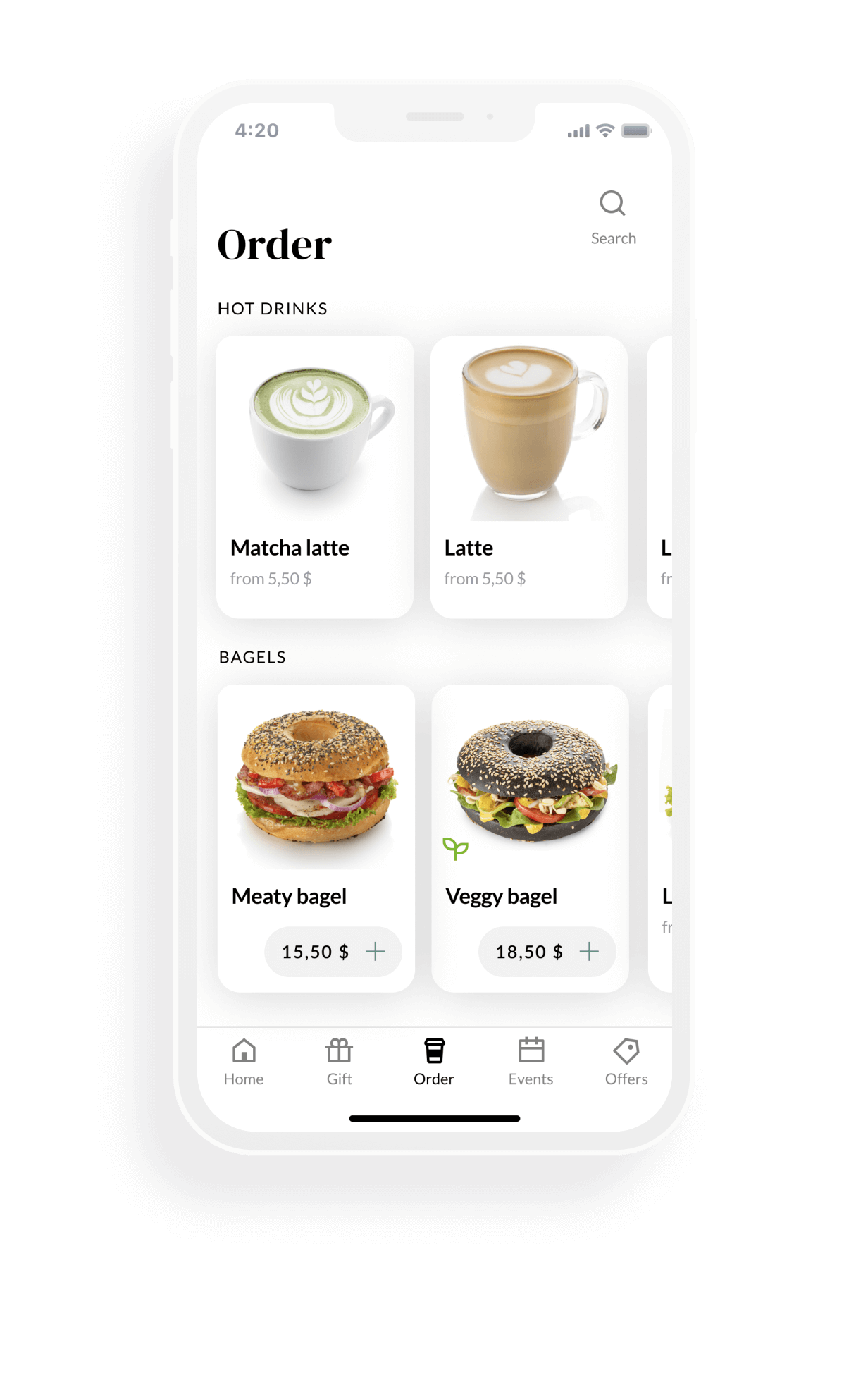
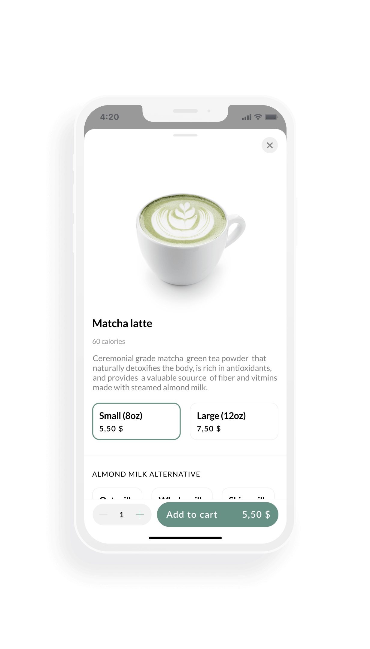
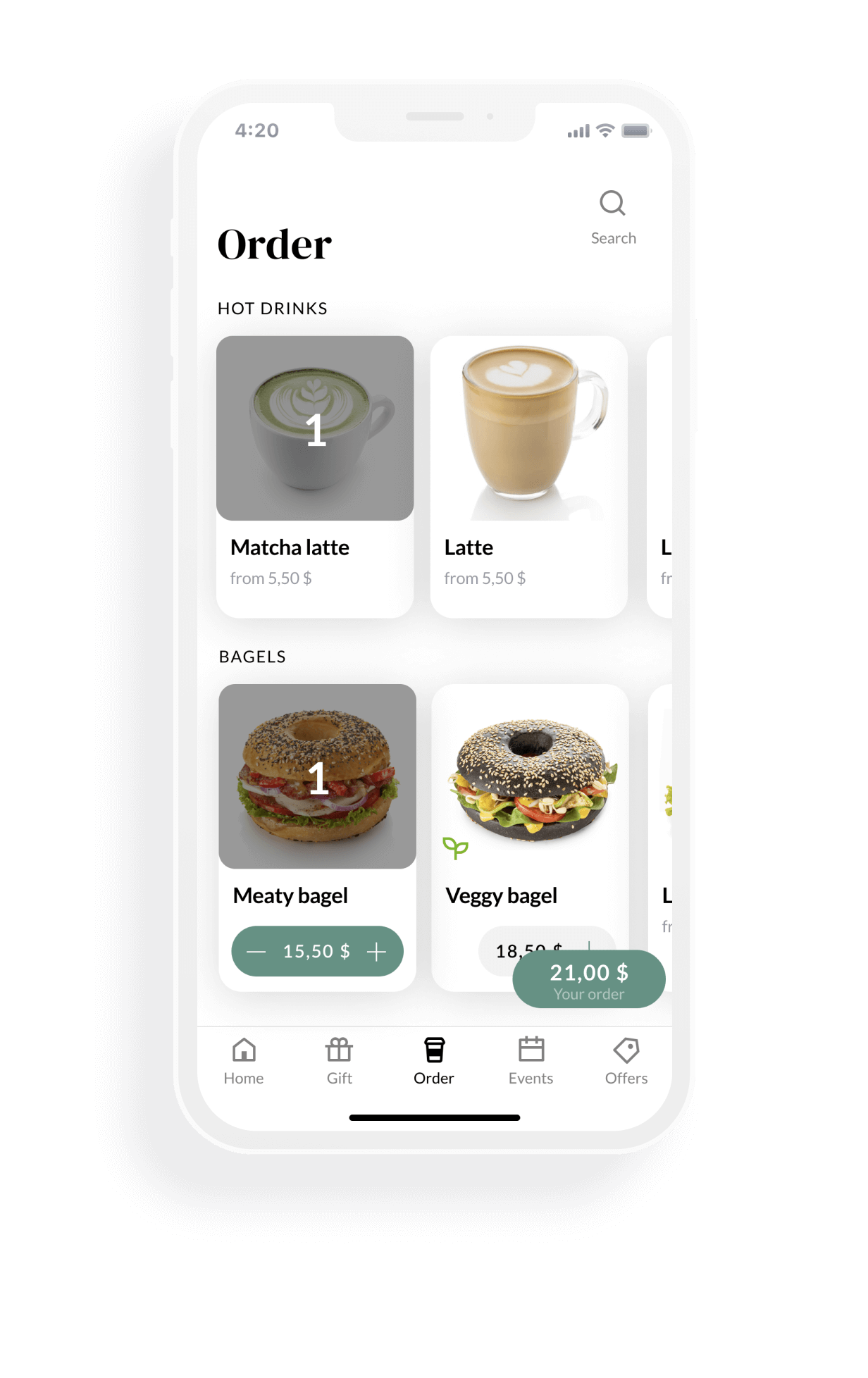
Testing of high fidelity prototypes allowed me to check conditions close to reality.
Mockups

Testing of high fidelity prototypes allowed me to check conditions close to reality.

High-fidelity prototype

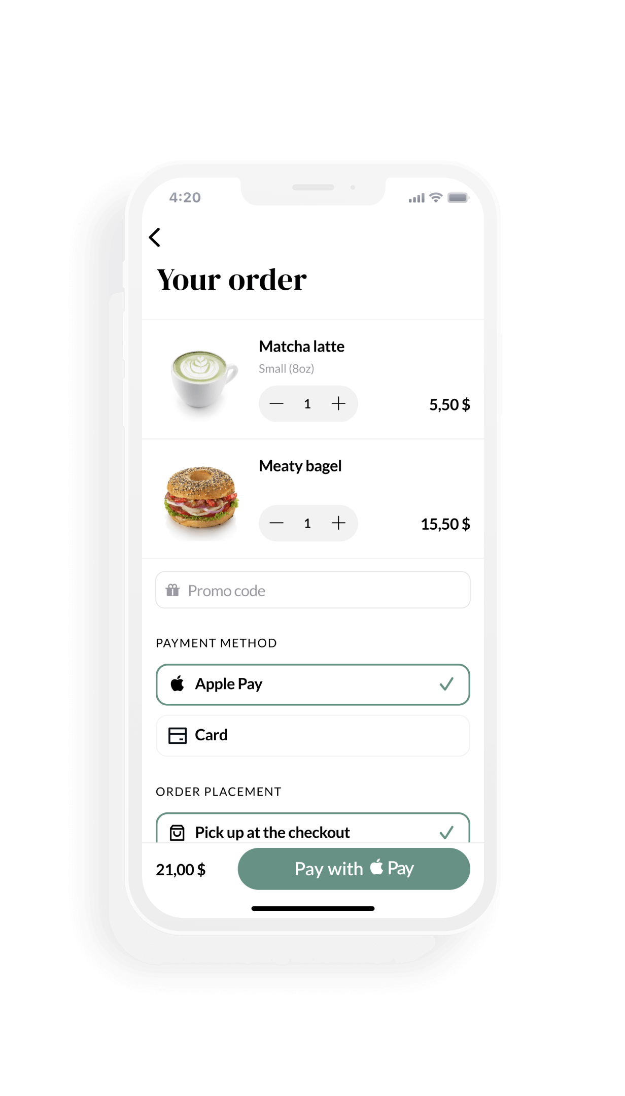
Accessibility considerations
✅ Provided graphical cues to guide non-literate users and people with cognitive disabilities. Combining text with images in menu.
✅ App is high-contrast by default (including all text and interaction design elements).
✅ Visuals and icons are paired with text, especially on navigation and call-to-action buttons.
✅ App is high-contrast by default (including all text and interaction design elements).
✅ Visuals and icons are paired with text, especially on navigation and call-to-action buttons.
Conclusion
I created this project while doing the Google UX course. My work experience includes 9 years of projects of different levels of complexity. But I also wanted to learn the very foundations. The UX course helped me to renew my knowledge with the best practices. Now I'm familiar with the full UX design process: product definition, research, analysis, design and validation. This experience from the top company Google I will use in my future projects.
More projects


