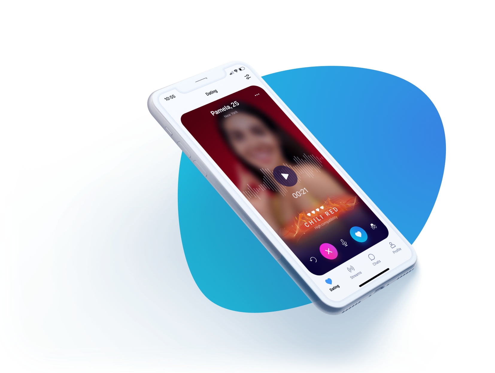
Project overview
2021 - 2022

Summary
The improvement of an existing product, redesigning old-fashioned screens.

The goal:
Increase user engagement by improving interfaces and testing new features.

My role:
UX/UI designer, UX researcher, visual designer

Responsibilities:
Creating design system, user research, conducting interviews with high-fidelity prototypes, competitor audit, accounting for accessibility, iterating on designs, visual design of App Store and Google Play
- Summary:The improvement of an existing product, redesign old-fashioned screens.
- The goal:Increase customer retention rate, improve lifetime value.
- My role:UX/UI designer, UX researcher, visual designer
- Responsibilities:Create design system, user research, conducting interviews with high-fidelity prototypes, competitor audit, accounting for accessibility, iterating on designs, visual design of App Store and Google Play
Design system
I didn't do the project from scratch, there had been a couple of designers on it before me.
So, there was little chaos in wireframes: different buttons, different style in illustrations. It was a huge problem for the developers, so one of my tasks was to create a design system and optimize the process of deliverables to the development team.
So, there was little chaos in wireframes: different buttons, different style in illustrations. It was a huge problem for the developers, so one of my tasks was to create a design system and optimize the process of deliverables to the development team.
Styles
include typography, color guidance and shadows (elevation).

Components
include buttons, pop-ups, icons, bottom navigation bar, text fields, chat elements, headers


Designs
These are the examples of mockups which I developed.


User flow
I visualized the user's movement through the product, mapping out each and every step the user takes — from entry point right through to the final interaction.

User flow of onboarding. Screenshot from figma.

User flow of profile. Screenshot from figma.
Research
My main instrument of research was interviewing and usability testing. Usually there were 5-6 participants. It was high-fidelity prototypes or just screens if I needed an express test.
Fresh hypotheses
Intro
There are lots of dating apps, and only 2 market leaders. There's no chance to win in this competition with the same features and a small startup team. So we decided to create hypotheses, one for every month. New features are unique and can attract new users.
Color of your voice
I want to share with you this feature as an example of hypothesis. User can record his voice and the algorithm will get matches based on voices compatibility.
Finding the best visualization
That was an interesting task, because we didn't find any analogs.

Variants of visualization feature "Color of Voice". Screenshot from figma.
The team chose waves for visualization, so the next step was to try different waves.

Next step, variants of waves. Screenshot from figma.
User survey
We wanted to know how interesting the colors would be for the users, if they should sound like different textures or natural elements. There was 28 answers and more than a half of users were interested in this style.

Results of survey
After choosing one variant of visualzation I started to find varieties of colors. Moodboard helped me with it.

Moodboards for feature "Color of Voice".
Results
Color of voice now is showing on the dating screen (with cards) and in chats.

Colors of Voice
Conclusion
All hypotheses were prepared by me in advance, so the development team could also do their part in time. The rhytm "1 hypothesis in 1 month" was kept. The main goal was to transform the app from MVP to a modern product and it was achieved.
More projects


